Tuesday, 11 November 2014

Accessing the Energy of Colour

Every now and then, people and ideas cross our path that are similar and compatible but not necessarily the same as our own beliefs. 

On my journey exploring whether to become an Image Consultant, I also explored the world of Feng Shui.  As someone who likes clear and clutter free, but is a natural hoarder trained with consummate post-war values, this little book was a godsend.  Scroll to the bottom of the link and you’ll find a connection to the audio version so you don’t have to further clutter your bookshelves!  

You don’t have to subscribe to the beliefs of Feng Shui to get value from this book – at every page turn, it felt like Karen Kingston had been looking over my shoulder!   How did she know about the box of ‘useful things’ under my desk, the broken bits and pieces that might ‘come in handy’ being stored in the cupboard?  So began my lifelong journey with clutter clearing and considering the impact of items on my energies.

This moved further into choosing things for the positive energies they bring which, with my training, extended into considering the energies of Colour and the impact they have on us.  For me, Colour is the root of everything, wearing and surrounding myself with my Colours feels good; from an alternative perspective, why do I feel on some days that I need a certain Colour? 

Recently, instead of being at the mercy of the clothing and choosing things that suit me, I’ve started experimenting with actively choosing things to wear from my wardrobe that will help me create the energy I want for the day.  

I’ve been working with my friend Vanessa Edwards, Feng Shui Consultant and Peace Ambassador, on her original list, incorporating the Energy of Colours and the benefits.

This coincides with a recent blog entry from Sue Donnelly, an independent consultant friend who specialises in Fashion Feng Shui and talks of intuitive dressing for health and energy….hey, that’s what I’ve been doing!  Sue’s blog provides another perspective on using Colour for positive coming from the Chakras.   

At House of Colour we believe that Colour is the start of everything around our appearance.  The right Style in the wrong Colour will not be as effective as the right Colour in the wrong Style because the first thing people look at is your face, where Colour has more impact.  Better still to identify your best Colours and combine them with your best Styles because everyone has a blue, a red, a yellow, a pink, a grey, – the question is, which shade of each Colour is the one which best complements your skin tone as each season has plenty of examples of light, dark and bright Colours?  So you can do exactly that – actively choose your Colours for the energy they provide and you want to invite into your life.


Over the coming months I’ll be working through these Colours – if you have anything to add, interesting anecdotes or stories, please email me at blog@houseofcolourhq.com.  I’ve never done this before so it will be fun trying something new! 

Tuesday, 21 October 2014

Wearing The Power of Neutrals

Sitting in a London cafĂ© waiting for my train I am surrounded by a sea of neutrals.  It’s not exclusive to this station, or indeed any station; I’ve seen plenty of it as I travel through the capital.  Commuters and travellers in their thousands wearing blacks, greys, whites, browns and beiges with the odd spattering of accent colour; a red hat, a pink bag, a purple coat. 

While I do believe that most of our great race are not confident enough in their knowledge of colour to risk experimenting with it “I would never have put these colours together, but I bought it from the website as suggested and it feels really good” - Kelly, Chrysalis Consulting is evidence that we can be moved safely into areas beyond our previous comfort zone.  It’s clear that neutrals have a place in the working environment, a cacophony might be too much of an affront or a distraction, so you learn how to push the boundaries appropriately and confidently.


A quick foray onto Wikipedia and I discover that the purpose of neutral in electricity is grounding. 

 
A fascinating article is provided by Wholistic Tennis on returning to neutral in a game of tennis and fully understanding the power of neutral whilst pinpointing a key challenge:
 
….In terms of tactical play we talk about offense, defense and neutral…………..
Neutral is the least glamorous, and for most people, the least enjoyable of the three possible conditions
 
…There is a great deal to learn in neutral.
 
The concept of neutral never changes although the neutral ball a player hits will change dramatically as he or she develops
 
Keep playing at your neutral and as you become bigger, stronger, quicker and as your strokes become more grooved and effortless your neutral will often automatically become bigger and bigger
 
It is impossible to win on offense alone….  One has to earn the right to play offense and playing solid neutral will offer you the opportunity to ultimately play offense.
 
Finally and very importantly, the patience required to stay in neutral is excellent mental training for the competitive player…………… 
 
And so, replacing the context of playing tennis with dressing for authority, i.e. being taken seriously, it is important to understand the power of neutrals as a foundation for your wardrobe, you then earn the right to use colour creatively and with confidence.
 
Ground your big or core investment pieces (suit, skirt, trousers, jacket) in a darker neutral and ring the changes of variety through fashion and your seasonal colours and styles of your tops and accessories.  Providing your weight doesn’t change drastically, a good investment garment will still be looking good and serving you well for years to come.

 
How interesting to hear fashion editor Anna Wintour’s response to the question ‘Is there anything you would refuse to wear?’ is simply ‘head-to-toe black’. 


So there you have it - identify the neutrals and how they work for you so that you can confidently apply colour or texture to achieve interest at your desired level of impact.  As with any successful recipe, it’s the balance of ingredients which makes the magic work; colour to neutrals is like cake to icing.  ‘Everything in moderation’ could be a wise approach.

 
Ground the core of your capsule wardrobe around your best neutrals, keep returning to them as the basis from which you launch yourself into offensive (high visibility) or defensive (low visibility) and you’ll grow from strength to strength!


Friday, 10 October 2014

Colours for Business

I’ve just returned from our annual conference where it is always a joy to see so many people (mostly, but not exclusively women) in one place looking so amazing; confident; In Focus; happy, comfortable and enjoying how they and their colleagues look; A perfect illustration of what is possible through using House of Colour services – creating empowered, authentic and visible people.

Some of our consultants choose to expand their training to incorporate our House of Colour in Business material, enabling them to deliver bespoke or tailored workshops into the full range of business environments.  From Schools and charities, self-employed, sole traders through to SME’s and Blue chip organisations there is something relevant for everyone who has an area of their life where they want to be taken seriously.  I suspect this applies to most people out of full time education, many still in it and clearly brings homemakers and carers into the remit – don’t we all want to be taken seriously? In a blog last year, I touched on what was possible;  One of the tools to achieve this, is understanding our individual colour rating.

For clarity and to enable you to use your colour analysis effectively, at House of Colour we use the tried and tested system of splitting the colour wheel into four quarters or distinct families called seasons and we refer to them by name; Spring, Summer, Autumn and Winter.  Each season represents a quarter of all the colours in the universe, so to further aid everyone, we identified 36 colours which represent the various points and extremes on the continuum of each season.  Evaluating these 36 colours against your unique skin tone and colouring, enables us to identify more precisely which are your best, most complementary and most flattering colours in the spectrum.   Some colours clearly work best as foundations, others as a big block, some next to your face and others provide amazing accents to punctuate and define your outfit.  This is your ‘colour rating’. 

We know just how powerful this work is if you use it but having Quality as one of our core values keeps us looking at how we can refine and enhance this offering for your benefit.  We discovered that what works best for us in our everyday lives doesn’t always serve us so powerfully in a business environment and vice versa.  Consequently, all Consultants attending our annual conference were introduced to the concept of Business Ratings as used in HOC in Business. 
What a revelation for many.  Mary (HoC Huntingdon and sometimes contributor to this blog - left) wrote a great review of her experience and discoveries in her blog and provided some great images of how the colours were working.  After 13 years, an experienced consultant there's still more to learn! 

Generally, although not exclusively, this is about using your neutrals (see table) – at the heart of our colour wheel - more powerfully. 

Autumn
Spring
·         Oyster
·         Khaki
·         Beige
·         Lizard Grey
·         Coffee
·         Camel
·         Bronze
·         Dark Brown
·         Navy
·         Cream
·         Oatmeal
·         Light Peach
·         Shell Pink
·         Dove Greys
·         Beige
·         Chocolate
·         Bright Navy
·         Oxford Blue
Winter
Summer
·         White
·         Silver
·         Greys
·         Stone
·         Mole
·         Charcoal
·         Black
·         Indigo
·         Navy
·         Winter White
·         Pink Beige
·         Dusty Pink
·         Mushroom
·         Rose Brown
·         Blue Greys
·         French Navy
·         Airforce

 .. And of course, all those shades that live in the gaps on the continuum between these colours!  (If you have any questions about this, please review your colour notebook and get in touch with your consultant, they’ll be happy to explain it to you.)
Business ratings are about using your neutrals to greatest effect; this Wyse Women article refers to neutral as a 'centred place', so next week I will expand on this with another analogy and look at the Power of Neutrals.  In following weeks, look out for entries on individual colours using the rainbow as my route guide!


Monday, 22 September 2014

Foundations for Colour

Last week I wrote about wearing black and came to the resounding conclusion that YES, everyone can wear it   …but why would you want to if it doesn’t flatter you!

A world without colour is unthinkable for most of us, and yet, walking down the high street, there is always an abundance of black, a heavy spattering of beige and usually a reasonable quantity of white available.  This is because they’re neutral colours which ideally form the backdrop to a wardrobe – the trick is to choose from the selection of neutrals that sit harmoniously in your colour palette to provide a supportive backdrop.

Back in the 1940s when colour film emerged on the scene the significance and impact of colour came to the fore.  The previously elegant and sophisticated actors/actresses somehow didn’t have the same effect – colour was recognised as the difference and the world of image consulting was born. 

In a previous blog  I’ve shown the screen test images of Julia Roberts as they made their colour choices for the 1990 Film, Pretty Woman.  I regularly cite this film as an excellent example of how we can change the way people perceive us simply by looking at the way we present ourselves. 


Choosing colours and styles that flatter you and honour your personality is an incredibly powerful way to help people to ‘get’ you –  giving them an idea of who you are, what you stand for, your values and ideals – not directly from what you wear but because what you’re wearing and how you construct your outfit will support and reinforce your verbal messages or undermine and conflict with them.  I’ve also talked about how, when you honour who you are with what you wear, you make it easy for your listener to hear you.

Liz Jones’ summary in The Daily Mail last week gives a few amusing takes on using colour: ‘You can wear any colour next summer as long as it’s white’ reminding me of the announcement I heard many years ago about ‘the Thursday club meeting on Tuesday to discuss what colour they were going to whitewash the walls of the village hall!’

While travelling in Asia a few years ago it was clear that white was a status symbol because it demonstrated that you could afford to keep up with the cleaning and maintenance.   As Liz astutely points out: ‘White hair to match is not compulsory… but expect your cleaning bills to soar’.  I love the white jacket I bought last year but don’t wear it as often as I might had I the time, money and staff to cover my cleaning requirements, including a Nanny to keep the children and their sticky fingers away!

I don’t however, agree with Liz’s statement that ‘You will not be able to avoid sheer next Spring…’  a confirmed classic that will be no hardship for me!  As for purchasing big pants, well, that’s entirely up to you but visible underwear is a faddy look and never for anyone serious about their image.  In this world of Personal Branding to gain competitive advantage, every little helps – or hinders!  


One of the most famous sheer looks on the planet (right) will clearly never be repeated  for that very reason – a far classier way to employ sheer is with the use of lace in a wedding dress (left).


See-through clothing reminds me of the Emperor’s New Clothes. It's interesting how some images protect his modesty with underwear whilst other interpretations have assumed the outfit to include the underwear.  Coming back to 2014/15, for me it’s another good excuse for the fashion industry to produce poor quality and justify it.  One golden rule to follow, the lighter the colour of your clothes, the higher the quality needs to be. 


All wardrobes, regardless of your season, need a foundation of neutrals which form the backdrop to a variety of outfits.  Adding colours to neutrals enables the full impact of the colours to be seen, excluding neutrals can provide an onslaught of colours which at best distracts your audience, at worst, causes them to look in the other direction.

With the release of our latest colour report, highlighting the colour trends for the Autumn/Winter Season, I thought it would make an interesting journey to explore how colour affects our lives over the next few weeks – including neutrals. 

Thursday, 11 September 2014

Anyone Can Wear Black!

Of course anyone can ‘wear’ black, and on the right skin tone it can look stunning - elegant, sophisticated and lovely but why would you want to if it doesn't suit or flatter you? 

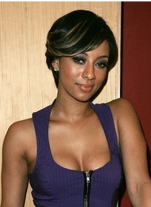
In the examples below, I suggest that black suits Victoria Beckham and American singer Keri Hilson but not Nicole Kidman, the best make-up artist in the world can't cover the gaunt look it gives her and the air of inauthenticity which doesn't exist in the other two photos.


Victoria Beckham
Nicole Kidman

Keri Hilson

I have friends from all seasons and the light that comes into people’s faces with colour, especially when they’re Spring, Summer or Autumn, is drained away when they put black on.  It’s as if someone has cut off their head, highlighted the dark rings around their eyes and prepared them for their own funeral!  Mary’s Halloween blog entry provided an entertaining view on the negative effects of black on a Spring! 

In all seriousness though, Clare Bumford provides a compelling article around why black is so important but where she says ‘why not?’ … I ask ‘why?’  There are many reasons, apart from funerals and black tie ‘dos’, that might cause people to choose black.  So let’s take a look:

It’s slimming
Is it?  Dark colours absorb the light making things seem smaller (slimmer), where light colours (e.g. white) reflect the light making something appear larger.  It’s an optical illusion property of all dark colours, not limited to black.  Far better to chose a dark colour which suits your complexion so that you look slimmer AND healthy!  Besides, there are other tricks to help you look slimmer - focus around wearing styles to suit your body shape and accentuating your assets/best features.

"The best colour in the whole world is the one that looks good on you"
Coco Chanel

It goes with everything!
Of course it does and, depending on your perspective, some people say, so does ketchup ! Black is a neutral colour and all outfits benefit from using neutrals to provide a supporting backdrop to the colours and patterns.  Neutrals from a complementary range of colours will enhance an outfit, but will diminish, even slightly, an outfit chosen from an alternative range to the neutral in question.  Choosing all your clothing  from the range of colours which complement you  provides you with neutrals that enhance you and you’ll find your neutrals do go with everything.
It’s easy!
If everything in your wardrobe is black then life is very easy!   Widely recognised in the energy world as an absorbative colour it could be seen as good for learning (absorbing everything, albeit it not selectively) but is more generally associated with depression due to absorbing everything.  It takes courage to know what suits you and wear it with confidence, but when you know WHICH colours are yours and WHY, choosing the colours which suit you from the full colour spectrum is easy.
It’s quality!
The quality and construction of a fabric is not easily visible on darker fabrics as they absorb the light.  We know that the lighter the colour, the more important it is to ensure quality is inherent in the garment construction, for example light coloured skirts and trousers need lining in order to be able to wear them away from the beach (see pictures). 
It’s available
It is and always will be, for all the reasons above, but you don’t have to rush into a purchase.  Knowing what suits us gives us the confidence to be more selective and wait for a great item of clothing to turn up in our style, size AND colour.  Supply and demand is my theory.  When people understand how to wear colours confidently they buy and wear them. 
Kettlewell affirm this by noting that House of Colour clients purchase more colours (than neutrals) than any other group.  They understand the amazing effect it has on our energy and and how we appear to others. 

 
In the following examples, I suggest that Victoria and Keri look sallow and inauthentic where Nicole, in her warm colour, looks healthy and naturally authentic. 


Nicole Kidman
Victoria Beckham
Keri Hilson
By selecting bright colours from their spectrums, to suit each individual, they all three look healthy, interesting, confident and authentic.

Nicole Kidman
Victoria Beckham

Keri Hilson


Give yourself permission and the freedom to use your best colours and not be bound by the inaccurate statement that everyone suits black!  Everyone can wear it, but it doesn't suit everyone!


Friday, 22 August 2014

Patterns -v- Plains

A friend and long term client of House of Colour sent me through this link earlier in the summer with the comment ‘I’m speechless!’   

From the raft of comments that bounced around social media it clearly hasn’t rendered everyone speechless!  The majority of comments, humorous though many were, merely shared the opinion that they didn’t like the outfits.  However, opinions abound in the 21st Century, it doesn’t take much of an invitation for them to fly generously and freely in the absence of action.  And with the Games now behind us (didn’t they do well!) the reality of the action, predictably far outweighed any commentary on the outfits.

So, with the caveat that the quality of the photograph may well be distorting the colour I’m going to lend my opinion. This is unusual for me because I generally prefer to ‘live and let live’.  If someone makes a different choice to one I might make, or selects something I actively dislike, I question them to understand what is driving their choice - criticising it says more about me than them.

Opinion 1: Select colours for a garment or outfit from ONE colour season to get the best benefit.


When it comes to choosing clothing with patterned fabrics I frequently despair.  I somehow missed learning about the colour wheel in school and so, it appears, have many fabric/pattern/designers.  Many beautifully styled garments appear ruined by the uneasy combination of colours the designers have selected.
  
These examples reinforce my belief that any discipline requiring participants to combine colours needs first to understand the colour wheel.  Further, when these colour combinations are to be worn by people, an understanding of how these colour families (we call them seasons) relate to the myriad of skin tones so that a range can be designed as close to the mid-point to suit as many as possible or, as Kettlewell intend, to cover all seasonal options so there is something for everyone.

‘Designed by textile artist Jilli Blackwood, the uniform includes turquoise, fuchsia and navy tartan’


This all sounds fine, until you discover the background is caramel (see below).  Navy and turquoise can bridge the gap between cool and warm tones but fuchsia is firmly rooted in the cool spectrum as much as caramel is in the warm.  To all you foodies out there, that’s like putting ketchup on your apple crumble or sugar on your bacon!

Opinion 2: Don’t mix patterns
At the age of 5, my friend’s daughter showed up wearing all her favourite clothes!  On a 5 year old it was cute and funny to be so ‘busy’, not classy, sophisticated or elegant though.  Patterns are fabulous but please show them in their best light by complementing them with a supporting plain and probably in a neutral colour.  If you MUST mix patterns, then learn how to recognise those that match in scale or at least genealogy. I believe we respond positively to balance and harmony and this is a wonderful example of inharmonious scale, colour and style all pulling in different directions – a tug of war with more than 2 ends!


The dresses are a nice touch, but at what point did Jilli think a ripple pattern would support and complement a tartan?  Looking at her appearance the answer is clearer, but therein lies the difference between creating an outfit which makes a statement reflecting your unique personality and designing uniforms and dressing for the masses.


One response tweeted ‘It’s refreshing and a definite surprise’ !


My fervent prayer is that fabric and pattern designers learn how to harmonise and complement – leaving competition to the athletes! 

Saturday, 16 August 2014

The Hidden Cost of Discomfort


15 years ago I bought my first adult bike.  Thanks to injuries sustained in a motorbike accident several years earlier I included front suspension and at the suggestion of the sales assistant, a suspension seat post. 

I loved riding that bike and regularly rode around the local lakes and meadows, into town and took the children to the ‘ice-cream’ park!

And then one day, disaster struck; it broke.  (Overly) confident from my regular riding, I discovered it was almost as cheap to buy a replacement bike as it was to repair it; a quick test ride around the car park and I was the proud owner of a new bike.

12 months later I realised that the bike was hanging dormant in the garage, I had stopped riding; why?  It hurt! The height of the handle bars was too low and, combined with the angle, left me with significant wrist pain after 10 minutes of riding.  And let’s say the contribution of the suspension seat post, I’d forgotten to specify, was sorely missed!

We often say to clients that we will wear something 2 or 3 times before regularly overlooking it in the wardrobe in favour of something else if it’s not comfortable.  Unfortunately, that recognition doesn’t always filter up to the conscious mind and so those items that we liked and spent good money on, reside as squatters in our wardrobes under the illusion that they will be worn again, one day! 

If it is a relief to take your clothes off at night, be sure that something is wrong. Clothes should not be a burden. They should be a comfort and a protection.


How many times have we tried to replace a favourite item with little success?  I was so comfortable on my original bike, I hadn’t realised which bits of the specification were important. 

I used a recent activity holiday to test out some different specifications and realised that the fundamental mismatch between my architecture and this new bike meant that the sensible solution, if I wanted to return to riding, was to admit my mistake, cut my losses and purchase another new bike – this time paying attention to replicating the original specification which had clearly worked.

Frequently, with our clothes, we don’t recognise what it is about an outfit which makes it enjoyable to wear, (colour, style, pattern, fabric, texture, fit, flexibility, durability, quality etc) which is why the replacement is never quite the same.  I’ve often felt this is partly due to the fact that we’ve never learnt what we need or quite what the comfort gives us!

I've been quite a late developer on the clothes front, but I've suddenly realised it is one of life's joys.
Benedict Cumberbatch

With the onset of this glorious summer, so the inspiration to try a little more exercise gained momentum and I’ve ventured out on a few early mornings.  My body’s memory of painful riding is fading; the more I ride my new bike, the more inclined I am to go again.

My usual forays are either 30 minutes on my own, or a slow amble of not more than 1 hour with the children.  On seizing a rare opportunity to go for an hour a few months ago, I discovered my helmet was the wrong shape for my skull and gave me a painful headache L.  I don’t expect you’ll be surprised to learn that I’ve enjoyed experiencing the wind in my hair of late! 

BUT, I had a friend who once said ‘£10 head, £10 helmet’ and he had a point – it saved my life on the motorbike.  So, guess where I went today?  That’s right, to buy a new helmet!

I’ve long suggested to clients that they wear a new outfit, especially shoes, around the house for a few hours at a time to make sure they are comfortable before that important occasion. 

I have a clear memory of one client who, just prior to heading off to Cyprus for her dream wedding, fortunately took this advice.  Her dress and lace overcoat were finished but on collection, and one final try, she discovered she’d lost weight.  The dressmaker hastily altered the dress for her and sent her happily on her way.  On arriving home, she asked me around to help make sure everything was perfect and we discovered that in haste, the lace overcoat was not re-tried at collection and thus had not been altered to accommodate the weight loss.  With a few days to spare before departure, and an obliging local seamstress, she still had time to fix it.

More than that, on ‘test driving’ her shoes around the house she discovered that 30 minutes was the absolute limit before that the ankle strap became uncomfortably tight.  A quick visit to the local cobbler to fit an extension piece and all was well.  We often laughed about how different her experience of her wedding might have been, distracted by an ill-fitting coat and painful shoes.

So here I sit, tapping away on this blog entry, wearing my new bike helmet (mine is silver J). Do I feel stupid? Not really! The children are in bed, my husband is at work and I’m not expecting anyone to arrive. 

I’ve adjusted the tension 2-3 times - I won’t be stopping every 5 minutes to adjust and readjust.  I’ve also used a pair of scissors to trim an irritating piece of ribbon where it has been frayed near the stitching on the chin strap.  I don’t tend to carry scissors with me on bike rides - that would have been just a little annoying!  Time well spent.  And more than that – if after an hour it doesn’t feel good, I can take it back to the shop for a replacement or refund having thoroughly tested it.

I love this quote from George Harrison:

There is one thing I have learned and that is not to dress uncomfortably, in styles which hurt: winkle picker shoes that cripple your feet and tight pants that squash your balls. Indian clothes are better

My ‘Indian Clothes’ don’t look so ‘Indian’ but I’m with him all the way on the comfort, it's a false economy to ignore it!