Showing posts with label Appearance. Show all posts

Monday, 24 August 2015

Green

Green

LIGHT GREEN
Good for growth, new ideas and a fresh approach
Fresh thinking, harmony, balance, rest, vigorous growth.

DARK GREEN
Denotes long nurtured traditions

Stability, dependable, reliability, reassurance


Green is a healthy colour according to this quote:

‘When you're green, you’re growing. When you're ripe, you rot.’ Ray Croc

I’ve always loved Green, but that is not the case for many of my clients I’ve seen through the years.   Given that there is a colour for everyone to look great in AND I’ve seen many people looking great in their best shades of greens, I’ve also experienced a greater frequency of clients expressing a dislike for green over and above any colour, even when it looked good on them.  I concluded over time that it must have something to do with the energy and/or the memories it was eliciting.

Everyone in the class agreed that she looked elegant and confident in her 2-star colours, so it was a surprise to hear her say, ‘I don’t like this colour!’

AND PAUSE! The power of silence to let her process what she had just said in contradiction to the feedback given by her friends in the class. As she absorbed the effect the colour was having on her, she continued, ‘And I know why I don’t like them!  The woman that went off with my first husband wore these colours’.

Fortunately, she was now happily married so we were able to engage in a conversation about how well she looked, how many ways she could use it, how to introduce it into her life more gently so that she could learn to love the colour the way the colour loved her!
This would probably have been a different experience if she had not been able to identify the source of her distaste so clearly! 

Was ‘the other woman’ the green-eyed-monster, or was she herself ‘green with envy’ a few years earlier?  I doubt the world would have looked like ‘Green and pleasant lands’

I’m not sure that any other colour conjures up emotions quite like green.  Green around the gills suggesting a certain level of nausea has a very different application to that of green fingers and of young people today being taught well with Green principles to respect, conserve and save their natural environment.  It is a very grounding colour in my experience and hence, when you consider its energy is that of ‘stability and reassurance’, a possible explanation for seeing green as a popular colour for interior design in traditional living rooms.

Green with envy/green fingers/green eyed monster


I love the sound of ‘sea green’ as well as the colour and the image it conjures in my mind of azure seas, Mediterranean holidays, warm balmy evenings and diving off the deck of the tourist boat. 


Equally delighted was my 6 year old recently with his illustrative description of ‘Troll Snot’ for my spinach based smoothie!

Unfortunately, I too am guilty of disparaging colours not to my liking and I’ve even heard others talk of the ‘sludge’ colour when describing autumn.  How much better to picture the leaves as they change and find something to create the image of ochres, oranges and olives in a Mediterranean orchard because, on the right person, that is the effect!

Your Greens range from:
Strong :
Light / Bright
Spring (warm & clear)
Leaf, Kerry
Apple, Mint
Summer (cool & soft)
Sea Green and Jade
Duck Egg to Pastel Aqua
Autumn (warm & soft)
Moss, Dark Olive, Forest
Light Sage
Winter (cool & clear)
Emerald and Pine Green
Ice green

Grow well with your greens, whether experimenting with the fresh and bright end of your spectrum as the vigorous growth of spring, or the deeper end enjoyed by the established trees of both conifer and deciduous forests.  There is something indisputably powerful about them, which could account for its ‘marmite’ reactions when people are introduced to their best greens!

Colour mixing your Greens

Spring
A soft background of neutrals (honey, beige, tan) can be complemented beautifully by a bright leaf green as well as a pastel collection of banana, peach and Apple
Summer
A deep collection of burgundy, plum, navy and sea green can always be lightened with a hint of pastel aqua. 
Or mix sea green with rose brown and mushroom
Autumn
Olives with Orange, Pine green with Royal purple
Winter
Emeralds with…

Green with envy/green fingers/green eyed monster


Tuesday, 21 October 2014

Wearing The Power of Neutrals

Sitting in a London cafĂ© waiting for my train I am surrounded by a sea of neutrals.  It’s not exclusive to this station, or indeed any station; I’ve seen plenty of it as I travel through the capital.  Commuters and travellers in their thousands wearing blacks, greys, whites, browns and beiges with the odd spattering of accent colour; a red hat, a pink bag, a purple coat. 

While I do believe that most of our great race are not confident enough in their knowledge of colour to risk experimenting with it “I would never have put these colours together, but I bought it from the website as suggested and it feels really good” - Kelly, Chrysalis Consulting is evidence that we can be moved safely into areas beyond our previous comfort zone.  It’s clear that neutrals have a place in the working environment, a cacophony might be too much of an affront or a distraction, so you learn how to push the boundaries appropriately and confidently.


A quick foray onto Wikipedia and I discover that the purpose of neutral in electricity is grounding. 

 
A fascinating article is provided by Wholistic Tennis on returning to neutral in a game of tennis and fully understanding the power of neutral whilst pinpointing a key challenge:
 
….In terms of tactical play we talk about offense, defense and neutral…………..
Neutral is the least glamorous, and for most people, the least enjoyable of the three possible conditions
 
…There is a great deal to learn in neutral.
 
The concept of neutral never changes although the neutral ball a player hits will change dramatically as he or she develops
 
Keep playing at your neutral and as you become bigger, stronger, quicker and as your strokes become more grooved and effortless your neutral will often automatically become bigger and bigger
 
It is impossible to win on offense alone….  One has to earn the right to play offense and playing solid neutral will offer you the opportunity to ultimately play offense.
 
Finally and very importantly, the patience required to stay in neutral is excellent mental training for the competitive player…………… 
 
And so, replacing the context of playing tennis with dressing for authority, i.e. being taken seriously, it is important to understand the power of neutrals as a foundation for your wardrobe, you then earn the right to use colour creatively and with confidence.
 
Ground your big or core investment pieces (suit, skirt, trousers, jacket) in a darker neutral and ring the changes of variety through fashion and your seasonal colours and styles of your tops and accessories.  Providing your weight doesn’t change drastically, a good investment garment will still be looking good and serving you well for years to come.

 
How interesting to hear fashion editor Anna Wintour’s response to the question ‘Is there anything you would refuse to wear?’ is simply ‘head-to-toe black’. 


So there you have it - identify the neutrals and how they work for you so that you can confidently apply colour or texture to achieve interest at your desired level of impact.  As with any successful recipe, it’s the balance of ingredients which makes the magic work; colour to neutrals is like cake to icing.  ‘Everything in moderation’ could be a wise approach.

 
Ground the core of your capsule wardrobe around your best neutrals, keep returning to them as the basis from which you launch yourself into offensive (high visibility) or defensive (low visibility) and you’ll grow from strength to strength!


Monday, 22 September 2014

Foundations for Colour

Last week I wrote about wearing black and came to the resounding conclusion that YES, everyone can wear it   …but why would you want to if it doesn’t flatter you!

A world without colour is unthinkable for most of us, and yet, walking down the high street, there is always an abundance of black, a heavy spattering of beige and usually a reasonable quantity of white available.  This is because they’re neutral colours which ideally form the backdrop to a wardrobe – the trick is to choose from the selection of neutrals that sit harmoniously in your colour palette to provide a supportive backdrop.

Back in the 1940s when colour film emerged on the scene the significance and impact of colour came to the fore.  The previously elegant and sophisticated actors/actresses somehow didn’t have the same effect – colour was recognised as the difference and the world of image consulting was born. 

In a previous blog  I’ve shown the screen test images of Julia Roberts as they made their colour choices for the 1990 Film, Pretty Woman.  I regularly cite this film as an excellent example of how we can change the way people perceive us simply by looking at the way we present ourselves. 


Choosing colours and styles that flatter you and honour your personality is an incredibly powerful way to help people to ‘get’ you –  giving them an idea of who you are, what you stand for, your values and ideals – not directly from what you wear but because what you’re wearing and how you construct your outfit will support and reinforce your verbal messages or undermine and conflict with them.  I’ve also talked about how, when you honour who you are with what you wear, you make it easy for your listener to hear you.

Liz Jones’ summary in The Daily Mail last week gives a few amusing takes on using colour: ‘You can wear any colour next summer as long as it’s white’ reminding me of the announcement I heard many years ago about ‘the Thursday club meeting on Tuesday to discuss what colour they were going to whitewash the walls of the village hall!’

While travelling in Asia a few years ago it was clear that white was a status symbol because it demonstrated that you could afford to keep up with the cleaning and maintenance.   As Liz astutely points out: ‘White hair to match is not compulsory… but expect your cleaning bills to soar’.  I love the white jacket I bought last year but don’t wear it as often as I might had I the time, money and staff to cover my cleaning requirements, including a Nanny to keep the children and their sticky fingers away!

I don’t however, agree with Liz’s statement that ‘You will not be able to avoid sheer next Spring…’  a confirmed classic that will be no hardship for me!  As for purchasing big pants, well, that’s entirely up to you but visible underwear is a faddy look and never for anyone serious about their image.  In this world of Personal Branding to gain competitive advantage, every little helps – or hinders!  


One of the most famous sheer looks on the planet (right) will clearly never be repeated  for that very reason – a far classier way to employ sheer is with the use of lace in a wedding dress (left).


See-through clothing reminds me of the Emperor’s New Clothes. It's interesting how some images protect his modesty with underwear whilst other interpretations have assumed the outfit to include the underwear.  Coming back to 2014/15, for me it’s another good excuse for the fashion industry to produce poor quality and justify it.  One golden rule to follow, the lighter the colour of your clothes, the higher the quality needs to be. 


All wardrobes, regardless of your season, need a foundation of neutrals which form the backdrop to a variety of outfits.  Adding colours to neutrals enables the full impact of the colours to be seen, excluding neutrals can provide an onslaught of colours which at best distracts your audience, at worst, causes them to look in the other direction.

With the release of our latest colour report, highlighting the colour trends for the Autumn/Winter Season, I thought it would make an interesting journey to explore how colour affects our lives over the next few weeks – including neutrals. 

Thursday, 11 September 2014

Anyone Can Wear Black!

Of course anyone can ‘wear’ black, and on the right skin tone it can look stunning - elegant, sophisticated and lovely but why would you want to if it doesn't suit or flatter you? 

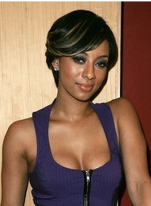
In the examples below, I suggest that black suits Victoria Beckham and American singer Keri Hilson but not Nicole Kidman, the best make-up artist in the world can't cover the gaunt look it gives her and the air of inauthenticity which doesn't exist in the other two photos.


Victoria Beckham
Nicole Kidman

Keri Hilson

I have friends from all seasons and the light that comes into people’s faces with colour, especially when they’re Spring, Summer or Autumn, is drained away when they put black on.  It’s as if someone has cut off their head, highlighted the dark rings around their eyes and prepared them for their own funeral!  Mary’s Halloween blog entry provided an entertaining view on the negative effects of black on a Spring! 

In all seriousness though, Clare Bumford provides a compelling article around why black is so important but where she says ‘why not?’ … I ask ‘why?’  There are many reasons, apart from funerals and black tie ‘dos’, that might cause people to choose black.  So let’s take a look:

It’s slimming! 
Is it?  Dark colours absorb the light making things seem smaller (slimmer), where light colours (e.g. white) reflect the light making something appear larger.  It’s an optical illusion property of all dark colours, not limited to black.  Far better to chose a dark colour which suits your complexion so that you look slimmer AND healthy!  Besides, there are other tricks to help you look slimmer - focus around wearing styles to suit your body shape and accentuating your assets/best features.

"The best colour in the whole world is the one that looks good on you"
Coco Chanel

It goes with everything!
Of course it does and, depending on your perspective, some people say, so does ketchup ! Black is a neutral colour and all outfits benefit from using neutrals to provide a supporting backdrop to the colours and patterns.  Neutrals from a complementary range of colours will enhance an outfit, but will diminish, even slightly, an outfit chosen from an alternative range to the neutral in question.  Choosing all your clothing  from the range of colours which complement you  provides you with neutrals that enhance you and you’ll find your neutrals do go with everything.
It’s easy!
If everything in your wardrobe is black then life is very easy!   Widely recognised in the energy world as an absorbative colour it could be seen as good for learning (absorbing everything, albeit it not selectively) but is more generally associated with depression due to absorbing everything.  It takes courage to know what suits you and wear it with confidence, but when you know WHICH colours are yours and WHY, choosing the colours which suit you from the full colour spectrum is easy.
It’s quality!
The quality and construction of a fabric is not easily visible on darker fabrics as they absorb the light.  We know that the lighter the colour, the more important it is to ensure quality is inherent in the garment construction, for example light coloured skirts and trousers need lining in order to be able to wear them away from the beach (see pictures). 
It’s available
It is and always will be, for all the reasons above, but you don’t have to rush into a purchase.  Knowing what suits us gives us the confidence to be more selective and wait for a great item of clothing to turn up in our style, size AND colour.  Supply and demand is my theory.  When people understand how to wear colours confidently they buy and wear them. 
Kettlewell affirm this by noting that House of Colour clients purchase more colours (than neutrals) than any other group.  They understand the amazing effect it has on our energy and and how we appear to others. 

 
In the following examples, I suggest that Victoria and Keri look sallow and inauthentic where Nicole, in her warm colour, looks healthy and naturally authentic. 


Nicole Kidman
Victoria Beckham
Keri Hilson
By selecting bright colours from their spectrums, to suit each individual, they all three look healthy, interesting, confident and authentic.

Nicole Kidman
Victoria Beckham

Keri Hilson


Give yourself permission and the freedom to use your best colours and not be bound by the inaccurate statement that everyone suits black!  Everyone can wear it, but it doesn't suit everyone!


Friday, 22 August 2014

Patterns -v- Plains

A friend and long term client of House of Colour sent me through this link earlier in the summer with the comment ‘I’m speechless!’   

From the raft of comments that bounced around social media it clearly hasn’t rendered everyone speechless!  The majority of comments, humorous though many were, merely shared the opinion that they didn’t like the outfits.  However, opinions abound in the 21st Century, it doesn’t take much of an invitation for them to fly generously and freely in the absence of action.  And with the Games now behind us (didn’t they do well!) the reality of the action, predictably far outweighed any commentary on the outfits.

So, with the caveat that the quality of the photograph may well be distorting the colour I’m going to lend my opinion. This is unusual for me because I generally prefer to ‘live and let live’.  If someone makes a different choice to one I might make, or selects something I actively dislike, I question them to understand what is driving their choice - criticising it says more about me than them.

Opinion 1: Select colours for a garment or outfit from ONE colour season to get the best benefit.


When it comes to choosing clothing with patterned fabrics I frequently despair.  I somehow missed learning about the colour wheel in school and so, it appears, have many fabric/pattern/designers.  Many beautifully styled garments appear ruined by the uneasy combination of colours the designers have selected.
  
These examples reinforce my belief that any discipline requiring participants to combine colours needs first to understand the colour wheel.  Further, when these colour combinations are to be worn by people, an understanding of how these colour families (we call them seasons) relate to the myriad of skin tones so that a range can be designed as close to the mid-point to suit as many as possible or, as Kettlewell intend, to cover all seasonal options so there is something for everyone.

‘Designed by textile artist Jilli Blackwood, the uniform includes turquoise, fuchsia and navy tartan’


This all sounds fine, until you discover the background is caramel (see below).  Navy and turquoise can bridge the gap between cool and warm tones but fuchsia is firmly rooted in the cool spectrum as much as caramel is in the warm.  To all you foodies out there, that’s like putting ketchup on your apple crumble or sugar on your bacon!

Opinion 2: Don’t mix patterns
At the age of 5, my friend’s daughter showed up wearing all her favourite clothes!  On a 5 year old it was cute and funny to be so ‘busy’, not classy, sophisticated or elegant though.  Patterns are fabulous but please show them in their best light by complementing them with a supporting plain and probably in a neutral colour.  If you MUST mix patterns, then learn how to recognise those that match in scale or at least genealogy. I believe we respond positively to balance and harmony and this is a wonderful example of inharmonious scale, colour and style all pulling in different directions – a tug of war with more than 2 ends!


The dresses are a nice touch, but at what point did Jilli think a ripple pattern would support and complement a tartan?  Looking at her appearance the answer is clearer, but therein lies the difference between creating an outfit which makes a statement reflecting your unique personality and designing uniforms and dressing for the masses.


One response tweeted ‘It’s refreshing and a definite surprise’ !


My fervent prayer is that fabric and pattern designers learn how to harmonise and complement – leaving competition to the athletes! 

Friday, 18 July 2014

The Healing Power of Colour

Having been heavily involved in the world of colour for many years, I’m used to meeting people who suddenly become conscious of the colours they are, or more probably are not, wearing. 

A couple of weeks ago, I met a friend who’s going through some challenging times.  She noticed she’d been wearing black recently during a period that felt like bad news on bad news.  We’ve all recovered from something in our lives, from a lost toy as a child through to lost friends, relatives and health.  Our reaction to each event and our recovery time, is relative to many other factors in our lives.   However, I’ve noticed colour frequently plays a part; whether it’s wearing colour as a confidence boost or removing colour due to a knock in confidence, the colours we surround ourselves in can give a clear indication to our emotional state.

I recall a situation when I had an important deadline to meet at work.  I woke up on the day of the deadline feeling awful but decided that the inconvenience to myself and others of missing the dealine through taking time off was not worth it.  I put on my red top, brightly patterned skirt and headed off to work with the intention of keeping my head down, getting the job done and not attracting attention – I didn’t feel like interacting with anyone.

Well blow me!  Nearly everyone who walked past my desk (remember, I’m feeling awful!) commented on how well I looked.  The effect was fascinating; as the day went on, I started to feel much better – the psychological impact of people saying I looked well rather than a sympathetic ‘Are you OK? You look a bit tired!’ was profound.

Feng Shui, Chakras and other energy disciplines understand that colours carry energy and represent elements of our life.  Why else would we decide that today is the day for the red (green/blue/yellow/brown) item of clothing?  Therefore, it stands to reason that our mood can dictate the colour choice or the colour choice can influence the mood.  Chromatherapy uses colours to actively promote healing and there are lots of references to the energy of colours and what they mean.

Two years ago my winter wardrobe was almost exclusively in the Burgundy/Purple/Smoked Grape/Pink range – incoroporating the need for love, grounding, creativity and homeliness… I was ‘recovering’ from the birth of my second child.
The following summer, I wore almost exclusively blues and pinks – incorporating comunication, peace, relaxation, safety, security and love.


So, how interesting to come across this really candid article  written by Jenni Murray relating to her experience of wearing black almost from the day she was diagnosed with cancer.  I can relate to everything she says about herself but also about her friends who’ve done the opposite and used colour to give themselves a boost through their recovery.   It’s easy to give advice from the outside about what we can do to improve our outlook, not so easy from the inside.
The power of image is subtle and yet immense.  If the image and perception is healthy, we feel uplifted, if the image and perception is less favourable we can feel downhearted; sometimes we’re just not ready to feel better.  


So what small steps can you take to enhance your reflection while keeping a low profile?

Have a colour consultation to find out what colours suit you and put these colours around your face so your reflection is lifted.
  • Make-up: knowing your colours enables you to achieve the subtle, natural glow
  • Hair colour: match warm tone skin with warm tone hair, and cool tone skin with cool tone hair.  Anything else competes and drains you.
  • Jewellery: Use the right metal colour for you (silver or gold), choosing beads, pearls and stones in your colours can bring real joy.
  • Tops and scarves: Choose the colours which reflect your healthy, positive, confident side to feel happier and more at ease in your skin (i.e. with your reflection).
Have a style consultation to identify flattering styles for your body … the one that you have now.  Learn to choose the right:
  • Shapes
  • Proportions
  • Neck lines
  • Patterns
 …to start feeling comfortable and gradually build your confidence.  You don’t want to be swamped or looking like you’re trying to squeeze a ‘quart into a pint pot’.

Jenni closes her article by saying:

‘I see a different woman from the one before.  I’d like to see her in the pink, but am not sure I ever will’


When the desire to achieve that goal becomes strong enough or the pain of sitting in the dark becomes intolerable, or we wake up one morning and decide to do something different, it’s amazing what can happen. With all these tools at hand, a dash of courage, a little action every day and a lot of friendship, love and support, you’ll be amazed at what is possible when you embrace The Healing Power of Colour.  

Friday, 4 July 2014

Knowing Your Colours – Empowering YOU

Knowing your colour season versus understanding WHY you’re a certain season are not necessarily related. 

Knowing -v- understanding
My niece has known from the age of 4 that she’s a Winter.  Last year, she had her colours analysed for her 15th birthday.  At this point she SAW it for herself and it’s had a profound effect on her understanding of (her) colours, what it MEANS to be a Winter and why certain colours don’t belong in her palette. 

My colouring has changed!
With the House of Colour system we analyse and identify people according to the season their colours fall in (Spring, Summer, Autumn, Winter).  By using a thorough, systematic process of analysis, based on your natural (genetic) colouring it’s our experience that people, when analysed correctly, stay with the same basic colour range (season); it’s your best/top/2-star colours within your range that may change over time or with tanning.  I find that some of my pastels look good on me in the summer but I need stronger colours in the winter (still from my season) to balance and complement my natural colouring.  Some people think you need to have your colours re-analysed I think you may just need a refresh – a fresh perspective. 

I used to be able to wear anything but now I can’t.
This is related to the fact that a younger or tanned skin tone can be more forgiving – there is more colour and definition in your skin tone to be drained away before you start to look tired.  As we get older, our skin and hair colour move closer together, making them less forgiving when we venture away from our core seasonal palette.  You’ve also got several more years’ experience of seeing images and reflections of yourself to recognise that some work better on you than others.


Thank you for giving me permission to wear something I love, but thought I couldn’t anymore!


Having the confidence to know something suits you and to wear it proudly is one of the biggest gifts we share as Colour Analysts.
Part of the human condition is concern about what people think of us, whether something suits us, makes us look stupid or is in fashion.  My teenage years were spent trying to find what suited me by asking my friends.  The opinions I received were rarely objective, more based on their own preference rather than an objective view of what flattered me.
The challenge of emotional interference. 

Bad experiences
Colours may evoke an emotional (positive or negative) response in us, (school uniform, fashion trends, parental imposition, favourite experience) disabling our ability to see whether they look good on us or not.
One overriding memory is of a client who, on realising she was an Autumn, immediately retorted  ‘I don’t like these colours….. and I  know why I don’t…. the woman who went off with my ex-husband wore these colours’.  By identifying this emotional repellent she was able to separate her colour selection from the emotional trauma of that marriage breakdown and give herself permission to look good.
Objectivity/Subjectivity 
As a consultant, analysing my elder son as a 6 week old baby, having only known him 6 weeks it was easier compared to his younger brother who was over a year old by the time I sat him down with the drapes.  As his mother, analysing a 12 month old was influenced by our year together and what I WANTED him to be rather than what he was!  But what a joy to be able to buy them clothes in colours that suit them and really see them shine as individuals.  More importantly, a sense of who they are through what suits them; enabling them to have freedom to choose and like their own colour choices rather than being influenced by each others’ subjective preferences.   

Practicality
Knowing what colours suit someone I’m choosing for means swapping and exchanging clothes is less hampered by the emotional baggage and possibility of offending someone.  Second hand clothing,  keeping the ‘hand-me-downs’ which work and dyeing, or freely releasing those which don’t, to someone else is a liberating and empowering place to be. 

I know someone who regularly buys presents for people in her own colours (and often styles) thinking, in the absence of knowing their colours, that this is a ‘safe’ colour.  Safe for her as the giver, not necessarily for the receiver if they are a different season/style!
A world without colour is unimaginable - the joy of colour is in surrounding yourself with those which empower you as an individual.  The challenge is in finding a compromise that works for everyone in the home when you are all different seasons!

Monday, 2 June 2014

Death and Public Speaking


It is often acknowledged that the two things people are most afraid of are death and public speaking. 

Most people can acknowledge that these are variations on Fear – of the unknown and being vulnerable.  Preston Ni has an interesting perspective, suggesting that these two fears are related by the fact that the fear of public speaking is the fear of emotional death!
 
 
Although it might not be so extreme, at House of Colour we’ve experienced people feeling intimidated by the thought of meeting an Image Consultant; they suddenly become self-conscious about their appearance, invest additional energy (compared to their normal levels) in thinking about what they’re wearing and apologise for various elements of their attire which they don’t have complete confidence in.  Otherwise confident people are reduced to varying degrees of nervousness. 

At the very least, this is something that needs to be acknowledged at the meeting introductions, and then put to one side, so that we can get on with the business of the meeting.  But what would it be like if you could remove most of the fear, releasing the energy for more productive use?
At our annual conference last year, we heard Mo Harford speaking about how our brains and thinking get in the way of our performance and producing great results.  In effect it is often only our beliefs which support (positive) or hinder (negative) us in our performance.
 
 
By focusing on getting your look ‘right’, i.e. one that you are comfortable in, comfortable with and that makes you look your best, you’re able to confidently step out and take care of the primary business at hand.  In the case of a ‘business’ person, this is getting on with their ‘business’!  


Special events can typically take a lot of our energy and attention when looking for the right outfit - often costing a lot of money - but it doesn’t have to.  For women, the problem often stems from a lack of confidence in coordinating items, so the safe option is to invest in a complete outfit which is clearly designed to coordinate and look good.  The problem with this approach is that you may have invested over £500 (clothing, accessories, shoes and in some cases underwear) and ended up with 1 outfit, rather than spending £500 on several items that can be used and adapted to create many more outfits in combination with clothing in your existing wardrobe.   Return on investment is about your cost-per-wear, shifting the focus to cost-per-outfit, an item of clothing or an accessory reveals itself as a good investment or not.
We need to know we look right, we have phrases such as ‘I need to put my face on’, ‘I’m having a bad hair day’, ‘I can’t go out without my lipstick/perfume/necklace (delete as appropriate)’.  All these statements point towards our need to ensure we ‘look the part’.  I particularly enjoyed reading this article on clothing related expressions!
 
Why are they fears? Because we all have a fundamental concern about what people think of us. This blog by Michael Hyatt gets succinctly to the point – take the focus off yourself!  Ironically, by focusing on yourself and your image, this is exactly what we are aiming for - get your physical presentation to such a level that you are able to take the attention off yourself and focus on the job in hand.
Maybe a business friend of mine who is considering a career transition from Business Consultant and Professional Speaker to Undertaker has the ideal solution to help you through your fears!